
Before the pandemic: Work in the imperialist core, toiling in the periphery
The title is formulated as a comment to Michael Roberts “Work or toil in the pandemic” as that was what gave me the impulse to this research.
Thanks to the Penn-data it’s possible to describe the changes in working hours per worker and per inhabitant in most of the world. At least back to the 1980-ies. Some countries all the way to 1950. The most important widening compared to the OECD statistics is the inclusion of China. Thanks to those data the periphery outside the imperialist core can be described and the economic whole world-system of globalized capitalism can be studied. Not in detail as the data for smaller countries in the periphery still is missing, but as a big picture.
I begin as I did with the OECD-statistics by drawing a diagram from all the available data.
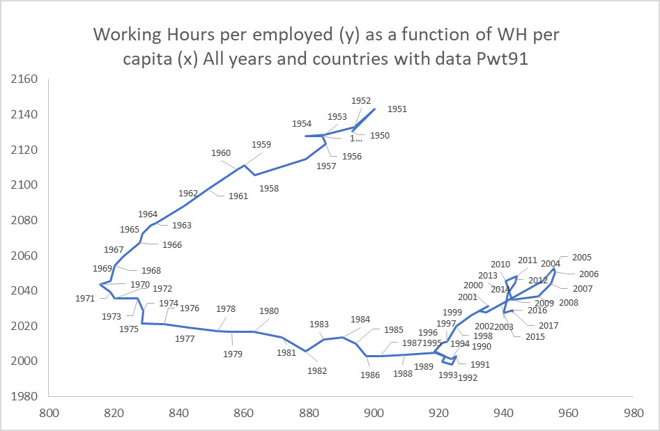
I think this diagram gets more reliable towards the end, as more countries have data and the methods for collecting data gets more and more standardized. Maybe. But on the other hand there is nowadays a declared economic war going on, and statistics is a comparably cheap and efficient weapon.
Anyway, the general direction of the world economy since about 1990 is towards longer hours for employed and growing cost of living for the populations. The opposite direction to the so called golden age 1950 to 1970.
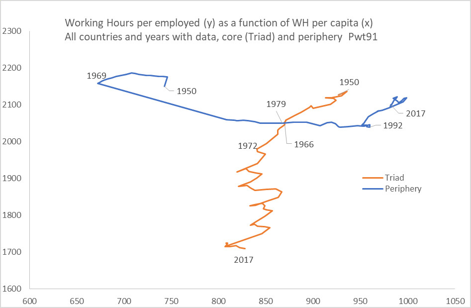
“Divided World Divided Class”
When I divide the country data along the lines that Samir Amin and many others use, on the one hand the Triad, USA Europe and Japan (plus the white colonies and other enclaves) and on the other hand all the others, the periphery, a clear pattern appears.
Convergent – divergent
It might have looked as the capitalistic core and the periphery was getting closer between 1969 and 1979. But it was only the beginning of a development in crossing directions. The core countries are zig zagging towards shorter hours and have about the same cost of living on average, even if as we know the distribution between rich and poor has become more uneven. In the periphery the working hours have been kept about the same but the cost of living has grown continuously. Until the crisis in the beginning in the beginning of the 1990-ies when the hours at work also started to grow longer.
More countries
When we compare the partitioned data with the total sum in the first diagram, we can see how the changes in the periphery makes more impression on the total in the later years. Even though the difference between the parts gets bigger. This is of cause an effect of the adding of data from more countries from the periphery and these countries having lager populations.
