
A non-monetary graphical description of the productivity growth in Sweden 1870-2017
In this paper I try to describe the growth of productivity in Sweden from 1870 until today. But the picture is from the outside. The graphical illustration in the form of an x-y diagram, only uses the data on hours worked, number of employed and the total population.
The x-variable in the diagram is calculated by dividing number of hours worked during a year with the total population the same year. The hours worked are then also divided by the number of employed that year and result of that is plotted as the y-value.
The points (x; y) are then connected in time-order by a line year by year, from the first to the last. This line illustrates the growth of productivity.
The diagram:
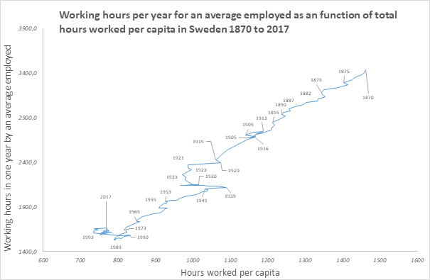
The horizontal position, on the x- axis, shows the number of paid working-hours during a year divided by inhabitants in Sweden. In 1870 the paid work used to clothe and feed and house and create all the luxuries of life per capita was about 1 450 hours in average. It was far less in 1993. About half as many, around 740 hours of work.
On the vertical y-axis is plotted the number of working hours is per employed person during the year. In 1870 the working year for those that executed the paid work was about 3 400 working hours. In 1983 it was less than half of that, something like 1500 working hours in a year.
As the blue line is drawn from each year to the following it shows not only the direction of change but also if the change between years is big or small. If the speed of change is fast or slow.
Years are shown in the numbers connected to the line.
The diagram does not begin at the null point of the axes. Its lowest value down in the left crossing of the horizontal and vertical axis is at x = 650, y = 1 400[i].
What does the line show?
The diagonal formed by the blue line from upper right to lower left corner shows there has been almost uninterrupted growth of productivity In Sweden from 1870 until 1984 at least. Development downwards and to the left in the diagram can be described as progressive, as working hours grow shorter for the working population and the working time needed per capita gets less.
The most interesting is the last part of the curve, where the development towards shorter working hours and less hours of work needed for the consumption has halted. The new shape of the line after 1999 is unique. There isn’t anything like that in the data from other states.
Let’s connect some of the dots on the curve to what has happened in the real world of Sweden’s economic history.
The loop around 1905 when the direction of change first goes almost straight to the left is when Norway left the union with Sweden. The dissolution was peaceful, much thanks to the radical Swedish labor movement which promised to rebel if the Swedish state started mobilizing. 1909 when the blue line turns backwards was the year of the general strike. The labor unions lost the strike and conditions for workers kept getting worse until the other European states started preparing WW1 and demand of manpower rose.
One can see that during 1939 to 1990 the blue line has almost the same slope as the period 1870 to the 1920-ies. But the line seems to be moved a bit to the right, towards more hours consumed per capita. In the beginning of that period, in the years 1933-39 Nazi Germany started building up its military power and Sweden also called up more recruits and bought more arms. The level of military expenditure varied a bit up and down but something like one year-class of the male Swedish youth was from then on doing military service lasting about a year, up to the dissolution of the Soviet Union 1990.
The three wrinkles on the line 1959, 1969 and 1973 coincides with the establishing and raising of value added taxes.
The turnaround in at the lowest part of the line was signaled by a big conflict in Swedish industry. About 700 000 employees were lock-outed about wages 1980. The lockout failed and the wages were raised.
1983 the then Social democratic majority voted to create wage-earner funds, built from progressive tax on profits. Some very important Swedish capitalists emigrated.
In 1990 there was an economic crisis, comparable to the famous Wall Street Crash 1929 when measured in the resulting loss of jobs[ii]. The effect of the crash were drawn out and was used to restore the private ownership to the best part of Swedish national wealth. 1991 Sweden asked for membership in EU and became member 1995.
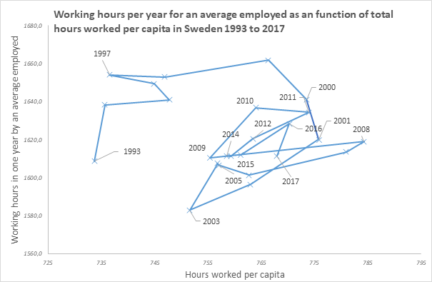
A few years later the blue line in the diagram seems to halt. A more detailed diagram shows that there still is some variation, but decreasing.
The variations from year to year seems to grow closer and closer to a central point, like the classic spider-type diagram showing changes in price and demand over time for a commodity. In this case the commodity would be labor force and the varying demand may be met by supply from migration organized by EU and the Swedish state. But not only. Apart from migration there is also the regulation by NAIRU-unemployment by the Swedish Central Bank. And there is flexible working hours for the employed.
Theoretical questions
The first question is of course if this is economy. There is no money in it.
But
according to Marx’s definition economy is a subject that concerns the human
metabolism with nature by (social) labor. Capitalism can be described as one
economy among many. And several earlier types of economy – most of the history
of the human race – used no money.
This method shows what is input in the capitalist monetary economy, in working
hours per capita, how much working time is demanded of an employed person and
what the economy gives out per capita to the total population.
The next question is if the diagram gives a true and relevant picture of capitalistic economy today. Capital is not shown except indirect by its effect on work, workers and total population. There is also no distinction between classes. Not even if income- which is also measured in working hours – comes from wage-labor done by the person receiving it or from profits or rent. Nor if the working hours are spent on productive or un-productive work. And nothing is said about the work done outside the money-economy. There is also no account of the wear and tear on the environment, which is a serious weakness. I still think the description by this method gives a broader view than what is common in National Accounts, but it’s very narrow anyway.
Some consequences from following these variables to their endpoints is at first rather surprising. If both x- and y-values gets near to zero one could predict proletarian socialism as it probably will become difficult to force proletarians to wage-slavery like today if working time is shared by all or nearly all – which it would have to be to get very much shorter hours. And when on the other hand the number of worked hours necessary for subsistence are becoming very few.
At the origin-point in the diagram there is no socially necessary work left. In that position t doesn’t seem possible to reproduce an economic class-society, so origin in the diagram might define a sort of communism.
The new
regulation of the Swedish economy since the turning of the century, seen in the
both diagrams, seems to be good only for growth and concentration of income and
fortune to the 1 percent in the top of Sweden’s earners[iii].
And at the same time the growth of the productive powers which according to
Marx would create good conditions for revolution and socialism has been
stopped.
Truly a win – win situation for the Swedish capital.
Further research
To really
be worthy of the epithet Marxism this method for depicting the growth of
productivity would have to show the difference between classes, types of
income, productive and unproductive work etc. It would also be interesting to
try to separate investments in variable capital and in means of production.
The balancing point in Swedish capitalism is a mystery. The method for reaching
it and why only Sweden seems to have got there deserves further study.
Sources and adaptions
Working hours had to be compiled from several different sources. I have tried to find data that are usable for international comparisons and also to link to the present official time-series production.
From 1870 – 1949 I have used Huberman and Minns “The times they are not changin’: Days and hours of work in Old and New Worlds, 1870–2000”, Table 1. http://personal.lse.ac.uk/minns/Huberman_Minns_EEH_2007.pdf
I have added some data in the beginning of this period from Tommy Isidorsson ”Kampen om tiden” p. 79 https://socav.gu.se/digitalAssets/1560/1560934_striden-om-tiden–tommy-isidorsson-160121.pdf
For the years 1950 – 2000 I have used Rodney Edvinsson’s Historic National Accounts http://www.historia.se/tablesAtoX.xls
For 2000 – 2017 there is data in Statistic Sweden National Accounts https://www.scb.se/hitta-statistik/statistik-efter-amne/nationalrakenskaper/nationalrakenskaper/nationalrakenskaper-kvartals-och-arsberakningar/
When I compared these sources I found that Huberman Minns and the data in the present series from Statistics Sweden is about the same, while Edvinsson’s figures were at a lower level. Edvinsson’s figures were adjusted to be at level with Statistics Sweden by a formula calculated by regression analysis.
To get some more points in the period 1870 – 1950 I decided to use values from Tommy Isidorsson which were taken from the union agreements, and adjust those to the level of Huberman Minns. This would give some more precise figures for the years between those in Huberman Minns. Then the years which still had no data were filled in by linear interpolation. The resulting time series can be found on my blog, at the bottom of the page http://www.fredtorssander.se/fredpress/2018/09/05/restaurationen-i-borjan-av-1990-talet-slutpunkten-for-den-svenska-kapitalismens-tillvaxtsaga/
A continuous time series of the Population of Sweden beginning 1860 can be found at Statistics Sweden http://www.statistikdatabasen.scb.se/pxweb/sv/ssd/START__BE__BE0101__BE0101A/BefolkningR1860/ It has been used without adjustments.
Number
of employed: In Rodney
Edvinsson Historic National Accounts (http://www.historia.se/tablesAtoX.xls
) is a column with the number of
employed 1850 – 2000. The level is close to Sweden Statistics Employed persons
aged 15-74 (LFS) which I use for the later years. I have used Rodney Edvinssons
data without adjustments for the period 1870 to 2000.
[i] There seems to be a long way left to go to get to the end of work and the basic income for all.
[ii] Oregon Office of Economic Analysis https://oregoneconomicanalysis.com/2012/09/24/checking-in-on-financial-crises-recoveries/
[iii] The National Wealth of Sweden, 1810–2014 Daniel Waldenström 2015 Figure 8. shows what I would call the restoration of private ownership of Swedish capital http://www.uueconomics.se/danielw/Research_files/National%20Wealth%20of%20Sweden%201810-2014.pdf
Swedish Government reports on the income distribution policy every year in the economic spring proposition. https://www.regeringen.se/49740c/contentassets/24b2129000954f969ab9bf6b4620dac9/fordelningspolitisk-redogorelse.pdf The effect on the different income-levels of reforms 1995 – 2016 is illustrated in diagram 2.1 in the report 2018: PROP. 2017/18:100 Bilaga 2
